

Errors and Omissions Excepted
Introduction
Imagine walking into a coffee shop and waiting in line for what feels like an eternity. Frustrating, right? That’s how users feel when a mobile website is slow to load. In 2025, mobile optimization isn’t just a nice-to-have—it’s essential. With mobile devices accounting for 58.67% of global website traffic in the last quarter of 2023(Statista, 2024) and Google’s Core Web Vitals Google’s Core Web Vitals influencing search rankings, knowing how to optimize WordPress for mobile is no longer optional. A slow site not only risks poor user experience but also potential revenue loss, as 53% of users abandon a site if it takes longer than 3 seconds to load. (Think with Google)
It’s time to transform your WordPress site into a speed machine that makes your users glad and search engines alike. Let’s dive into the how to optimize WordPress for mobile for 2025!
Table of Contents
Understanding Mobile Optimization Essentials
What is Mobile Optimization?
Before discussing how to optimize WordPress for Mobile, let’s discuss what mobile optimization really is. Mobile optimization is the process of designing and improving your website to deliver a seamless experience on mobile devices. In simpler terms, it’s like tailoring a suit to fit perfectly—ensuring your WordPress site looks great, loads fast, and works flawlessly on smartphones and tablets.
Important aspects of a mobile-optimized WordPress site may include:
- Responsive Design: Ensuring your site automatically adjusts to fit any screen size.
- Quick Load Times: Reducing delays to keep users engaged.
- Clear Navigation: Making it easy for users to find what they need, even with a thumb swipe.
- Readable Content: Avoiding tiny text and ensuring content scales properly.
Key Metrics to Measure Mobile Performance
You can’t improve what you don’t measure. Here are some critical metrics to assess how your WordPress site performs on mobile:
- Page Load Time: Faster is always better. Aim for load times under 2.5 seconds. Slow load times can lead to higher bounce rates, reduced engagement, and missed opportunities.
- Mobile-Friendly Test Results: Tools like PageSpeed Insights can identify issues like Largest Paintful Content Elements, unused JavaScript, or unoptimized images.
Mastering these essentials is the first step in learning how to optimize WordPress for mobile. The goal is to provide a smooth experience so users feel like your site was built just for their devices.
How to Optimize WordPress for Mobile
Here’s a professional yet approachable 25 strategies about how to optimize WordPress for mobile effectively.
1. Use a Mobile-Responsive Theme
Think of your WordPress theme as the foundation of your website. A mobile-responsive theme is like a flexible fabric that can adjust to any device, ensuring your site looks great on everything from a tiny smartphone to a large desktop monitor.
How to Do It:
- Visit your WordPress dashboard and navigate to Appearance > Themes.
- Look for modern, lightweight themes like Astra, GeneratePress, or Neve.
- Preview the theme to ensure it adapts well on mobile screens.
- Activate it and customize it under Appearance > Customize.
You may try BB theme WordPress as well (an article available), and if you are a digital marketing agency, you should look for SEOWP Theme (an article available)!
Why It Matters:
Non-responsive themes can make your site look cluttered and awkward on mobile, with misaligned buttons and unreadable text. This frustrates visitors and increases bounce rates—bad news for your rankings!
2. Optimize Images
Images are like spices in a dish—they add flavor, but they can ruin the experience as well. On mobile, unoptimized images slow your site, driving users away.
How to Do It:
- Use plugins like Smush or EWWW Image Optimizer to compress images.
- Save images in modern formats like WebP or AVIF for faster loading.
- Resize images before uploading; for mobile, keep the width under 800px.
Why It Matters:
Large, uncompressed images can consume more bandwidth, making your WordPress website sluggish on mobile. Slow load times can tank your SEO and leave users tapping the back button.
Additional Tip:
Enable lazy loading for images using WordPress settings or a plugin. This ensures images load only when users scroll down to them, saving precious seconds.
3. Enable Lazy Loading
Lazy loading is like a butler who only serves what’s needed at the moment. Instead of loading all your website’s images and videos at once, lazy loading loads them as users scroll, improving speed and user experience.
How to Do It:
- Go to your WordPress dashboard and install a plugin like Lazy Load by WP Rocket or Smush.
- Activate the plugin and enable lazy loading for images and videos.
- Test the feature to ensure content appears smoothly as you scroll.
Why It Matters:
Without lazy loading, your website downloads every asset at once, increasing load time and using unnecessary data. For mobile users with limited data plans, this can be a dealbreaker.
Additional Tip:
Pair lazy loading with a caching plugin like WP Rocket for even better performance.
4. Install a Caching Plugin
Caching is like storing a snapshot of your website for quick delivery. When a user visits your site, the server doesn’t have to process everything from scratch—this can speed up load times.
How to Do It:
- Install a caching plugin like WP Rocket, W3 Total Cache, or LiteSpeed Cache.
- Configure the settings to enable mobile caching specifically.
- Clear your cache regularly to ensure users see updated content.
Why It Matters:
Caching reduces server load and speeds up delivery times. Without it, your WordPress site processes every request in real-time, making mobile browsing painfully slow.
5. Use a Content Delivery Network (CDN)
Imagine your website as a book being borrowed from a library. If there’s only one library (server) far from users, it takes longer to get the book. A CDN creates multiple “libraries” (servers) worldwide, so users can access your site faster.
How to Do It:
- Sign up for a CDN service like Cloudflare, BunnyCDN, or KeyCDN.
- Configure the CDN with your WordPress site using plugins like Cloudflare (or through WP Rocket) or CDN Enabler.
- Test your site speed on tools like GTmetrix to see the difference.
Why It Matters:
Without a CDN, users far from your server may experience slower load times, especially on mobile. A CDN can ensure consistent speed and performance, no matter the user’s location.
Additional Tip:
Pair a CDN with a caching plugin for optimal performance. Always choose a CDN that supports mobile optimization for maximum impact.
6. Minify CSS and JavaScript

CSS and JavaScript files are like a messy closet—full of useful things but cluttered. Minifying may remove unnecessary spaces, comments, and redundant code, making the files lighter and faster to load.
How to Do It:
- Install a plugin like Autoptimize.
- Enable CSS and JavaScript minification in the plugin settings.
- Test your site thoroughly to ensure nothing breaks.
Why It Matters:
Unminified files can increase page size, leading to slower load times on mobile devices. A leaner codebase ensures quicker rendering.
Additional Tip:
If you notice broken layouts, exclude certain scripts or stylesheets from minification through the plugin settings. If it doesn’t work, deactivate the plugin.
7. Use Accelerated Mobile Pages (AMP)

AMP reduces your pages to their bare essentials, creating super-fast, mobile-optimized versions. It’s like offering a “lite” version of your website for mobile users.
How to Do It:
- Install the AMP for WP plugin.
- Configure settings to match your design preferences.
- Test the AMP version of your site using Google’s AMP validator.
Why It Matters:
AMP can improve load times, ultimately boosting SEO rankings for mobile searches. Without it, users may experience delays on slow networks.
Additional Tip:
Don’t apply AMP to your entire site—use it for blog posts or content-heavy pages.
8. Simplify Navigation

On mobile, complex navigation menus can feel like navigating a maze. Simplifying the menu can improve usability and reduce bounce rates.
How to Do It:
- Use plugins like Max Mega Menu to create collapsible menus.
- Limit the number of menu items to five or fewer.
- Add a “Back to Top” button for easier navigation.
Why It Matters:
Cluttered navigation can confuse mobile users and make them abandon your site quickly. A clear, concise menu can keep them engaged.
Additional Tip:
Stick to one-level menus on mobile to avoid nested options that are hard to tap.
9. Add Touch-Friendly Elements
Mobile users browse through your site using fingers, not a mouse. Buttons, forms, and links need to be large enough for easy tapping.
How to Do It:
- Use a minimum button size of 48×48 pixels.
- Add adequate spacing (10-12px) between clickable elements.
- Test usability with tools like BrowserStack to simulate touch interactions.
Why It Matters:
Tiny buttons or closely placed elements can cause frustration and errors, leading to a poor mobile experience.
Additional Tip:
Use CSS properties like hover and focus to give users visual feedback when they tap.
10. Disable Auto-Play for Videos
Auto-playing videos on mobile is like an unexpected loudspeaker in a library—disruptive and annoying.
How to Do It:
- Use your video embed settings to disable auto-play.
- If using a page builder, toggle off the auto-play option for video widgets.
Why It Matters:
Auto-play increases page load times and consumes mobile data, irritating users and ultimately causing them to leave your site.
Additional Tip:
Instead of auto-play, provide a play button with a thumbnail image to encourage user interaction.
11. Optimize Forms for Mobile

Forms are a crucial part of your site, but on mobile, they can feel like filling out paperwork on a bumpy ride.
How to Do It:
- Use plugins like WPForms to create mobile-friendly forms.
- Enable autofill for fields like name, email, and address.
- Reduce the number of required fields to the essentials.
Why It Matters:
Complicated forms discourage users from completing them, especially on mobile. A streamlined form can improve conversion rates.
Additional Tip:
Use large input fields and dropdowns for ease of use on smaller screens.
12. Reduce Redirects
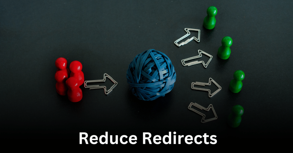
Redirects are like taking detours while driving—they slow you down. Mobile users especially may don’t have the patience for unnecessary delays.
How to Do It:
- Audit your site for redirects using tools like Screaming Frog or Ahrefs.
- Remove or consolidate redirects wherever possible.
Why It Matters:
Excessive redirects can increase load times and frustrate mobile users. A direct path to the content can keep visitors happy.
Additional Tip:
For necessary redirects, use 301 (permanent) redirects (Use Rank Math) instead of temporary ones.
13. Hide Heavy Elements on Mobile
Not everything designed for desktop belongs on mobile. Heavy elements like large sliders or animations can bog down your site.
How to Do It:
- Use a page builder to hide specific elements for mobile.
- Add custom CSS-like display: none; to disable heavy elements.
Why It Matters:
Large elements can increase load times and make navigation harder on mobile. Removing them can improve both speed and usability.
Additional Tip:
Replace heavy sections with lightweight alternatives, like text or static images.
14. Preload Critical Resources

Preloading is like setting the table before a meal—it ensures everything users need is ready when they arrive.
How to Do It:
- Use a plugin like Perfmatters to preload fonts, images, and key CSS files.
- Identify critical resources using tools like Lighthouse or GTmetrix.
Why It Matters:
Without preloading, key assets may load late, causing visible delays and layout shifts on mobile.
Additional Tip:
Prioritize above-the-fold content to create a seamless first impression.
15. Use Mobile-Specific Images

Mobile devices don’t need desktop-sized images. Serving smaller images can save bandwidth and speed up loading.
How to Do It:
- Use the <picture> tag to serve different image sizes based on the device.
- Install the Adaptive Images plugin for WordPress.
- Customize the image for each device separately if your page builder offers a “responsiveness” feature.
Why It Matters:
Oversized images slow down mobile performance. Mobile-specific images can provide an optimized experience.
Additional Tip:
Use responsive image attributes like srcset to automate this process.
16. Host Google Fonts Locally

Fetching fonts from Google servers can slow your site. Hosting them locally is like having your own supply on hand—quick and reliable.
How to Do It:
- Download the fonts you use from Google Fonts.
- Upload them to your WordPress site and link them in your CSS.
Why It Matters:
External font requests can take longer to load, especially on mobile. Local hosting eliminates this delay.
Additional Tip:
Limit the number of fonts and weights you use to reduce file size further.
17. Enable Critical CSS Delivery
Critical CSS ensures the essential parts of your design load immediately, creating a smooth experience for mobile users.
How to Do It:
- Use plugins like WP Rocket or Autoptimize to generate critical CSS.
- Test your site to ensure no styles are missing.
Why It Matters:
Without critical CSS, mobile usersusers’ experience might be delayed.
Additional Tip:
Focus on above-the-fold content for the most noticeable impact.
18. Serve Images in Next-Gen Formats
Modern image formats like WebP load faster while maintaining high quality.
How to Do It:
- Use plugins like Imagify or Smush to convert images to WebP.
- Test compatibility with different browsers before enabling.
Why It Matters:
JPEG and PNG files are larger and take longer to load. WebP reduces load time significantly, especially on mobile.
Additional Tip:
Always keep a fallback for browsers that don’t support WebP.
19. Test Mobile Page Speed Regularly
Frequent testing can keep you ahead of performance issues.
How to Do It:
- Use tools like Google PageSpeed Insights, GTmetrix, or Pingdom.
- Focus on improving metrics like First Contentful Paint (FCP) and Speed Index.
Why It Matters:
Regular testing helps you identify and fix mobile performance bottlenecks before they affect users.
Additional Tip:
Set a monthly reminder to audit your site’s mobile speed.
20. Avoid Pop-Ups on Mobile
Pop-ups on mobile can feel like a roadblock—annoying and hard to dismiss. They can disrupt user experience and may negatively impact your search rankings.
How to Do It:
- Use plugins like OptinMonster to create mobile-friendly pop-ups.
- Configure pop-ups to appear as non-intrusive banners or slide-ins.
- Set pop-ups to disapper easily with a close button that’s large enough to tap.
Why It Matters:
Google penalizes sites with intrusive pop-ups, reducing visibility in search results. Visitors can leave if they can’t close a pop-up easily.
Additional Tip:
Time your pop-ups strategically—after the user spends at least 15-30 seconds on your page.
21. Compress Your Database

Your database is your website’s brain, storing all necessary data. Over time, it can get filled with unnecessary information, slowing down your site. Compressing and cleaning it boosts mobile performance.
How to Do It:
- Use plugins like WP-Optimize, WP Rocket, or Advanced Database Cleaner.
- Remove unused drafts, spam comments, and expired transients.
- Schedule regular database cleanups through the plugin.
Why It Matters:
A bloated database can slow down queries, especially on mobile, where speed is critical. Compressing can ensure quicker access to data.
Additional Tip:
Always back up your database before performing any cleanup to avoid accidental data loss.
22. Optimize Fonts for Mobile
Fonts that look great on desktops can be heavy and slow to load on mobile devices. Simplifying your font usage ensures faster loading and better readability.
How to Do It:
- Limit the number of fonts to 2-3 and avoid excessive font weights.
- Use system fonts like Arial, Helvetica, or sans-serif for faster loading.
- Compress custom fonts using tools like Font Squirrel.
Why It Matters:
Heavy fonts can add extra load time, making your WordPress site less mobile-friendly. Clean, lightweight fonts can create a polished, professional look.
Additional Tip:
Set a base font size of 16px to ensure readability on small screens.
23. Use Excerpts Instead of Full Posts on Blog Pages
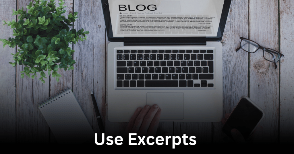
Showing full blog posts on mobile can overwhelm users and slow down your site. Excerpts offer a sneak peek, encouraging users to click through for more.
How to Do It:
- Go to Settings > Reading in your WordPress dashboard.
- Set the “For each article in a feed, show” option to excerpt.
- Customize excerpts further using plugins like Advanced Excerpt.
Why It Matters:
Displaying full posts on mobile can increase load times and make scrolling tedious. Excerpts reduce page size and can improve user engagement.
Additional Tip:
Include a compelling call-to-action (e.g., “Read More”) to encourage clicks.
Final Thoughts
These 20+ strategies are not just about how to optimize WordPress for mobile—they are probably foundational steps to create a blazing-fast, user-friendly experience for every visitor. From choosing responsive themes to compressing images, implementing caching, and minimizing redirects, every step can contribute to a faster, more user-friendly mobile experience.
Stay tuned for the next set of strategies to take your optimization game to the next level!
[sp_easyaccordion id=”4277″]
Follow Skills Climber for me!

